Nike - Altair Branding
As a side project during my time at Nike, I partnered with a newly formed team to design and develop a fresh, vibrant brand package that extolls the team’s values and mission and brings everyone together under a unified banner.
In keeping with Nike’s ongoing initiatives emphasizing the power of diversity and inclusion, the brand package includes multiple additional colorways for enhanced personalization, promoting individual strengths as part of a cohesive team dynamic.
Project Background
My Role
• Client focus grouping & implementation research
• Initial logo ideation, sketches, and concepts
• Pitch concepts to client, presentation design & delivery
• Revision rounds, logo polishing & final presentation
• Design of additional materials, lockups for all use cases
Research and early concepts in progress
In the initial creative brief meeting, I learned that the team voted and picked the name Altair for the star in the Aquila constellation, placing an emphasis on imagery of both stars and space, and the eagle for which the constellation is named. We quickly landed on the visual stylings of NASA and private space company mission patches as a strong source of inspiration for the brand, and I got started on my research.
After analyzing over 150 mission patches across several eras of space exploration, I honed in on six primary shapes and themes that repeated most often. After extensively studying a myriad of visual representations and stylings for constellations, eagles, and stars, I developed four logomarks that I found most strongly exemplified Altair’s ideas as both an independent team and a part of the greater Nike community. Below you can see my sketching and iterative logo refinement processes.
To present the concept work to the clients, I applied a high level of polish to each candidate, mocked them up on likely real-world implementations, and described the thought process behind each.
The goal was to present each concept as a strong, viable solution to the creative challenge, so the clients would be happy with any of the four options. In this booklet, I employ strong visual presentation with compelling, thoughtful storytelling to create a brand experience that lets the clients “try on” the final product.
Concepts Presentation
I love creating visual marks that are bold and communicative at a glance, but reveal more detail the longer you look at them, with what I enjoy referring to as “visual puns”. The Altair logo features the Nike Swoosh rotated 180º to become the eagle’s beak. Additionally, parts of the Swoosh are carefully sliced and extracted to form its eye, infusing the brand with recognizable Nike DNA without being too overt about it.
Nike DNA built in
Sandpoint Lodging Co.
Sandpoint, Idaho is an area well known for its incredible natural beauty and myriad of summer and winter activities, being nestled between a ski resort mountain and an expansive lake. Understandably, the vacation rental industry is intensely competitive. Sandpoint Lodging Co. was a newcomer looking to stand apart from the corporate feel of the other agencies, and approached me to develop a brand that invites people to come stay, play, and fall in love with the area.
Project Background
My Role
• Initial logo research, sketches, and concepts
• Work presentation to clients, feedback collection
• Revision rounds, logo polishing & final presentation
• Design of additional lockups, implementations, and branding style guide
Research and early concepts in progress
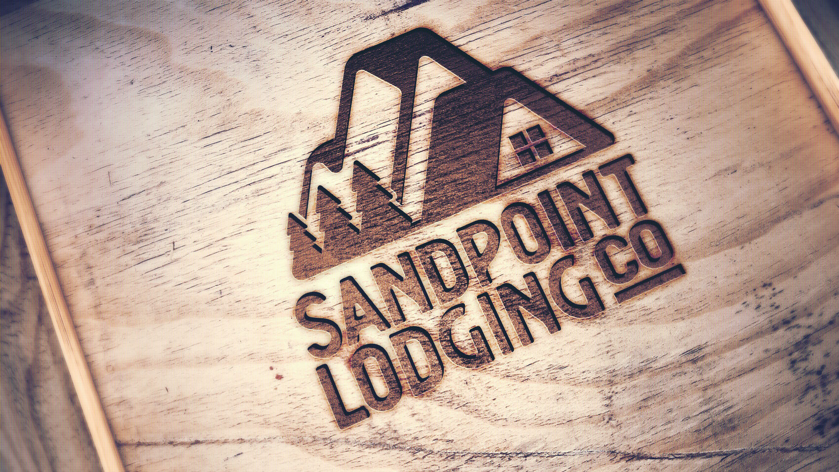
Similar to the City of Sandpoint logo project, part of the brief was that the client wanted to showcase the natural beauty of the area, namely the mountains and trees. In the Pacific Northwest, it’s a challenge to make a logo with mountains and trees in it stand apart from the crowd, so I wanted to incorporate what I call a “visual pun” and also lean into the “lodging” part, since the client had a unique take on the types of homes they were offering; a more lodge-esque, woodsy, cozy yet glamorous cabin-in-the-woods type feel.
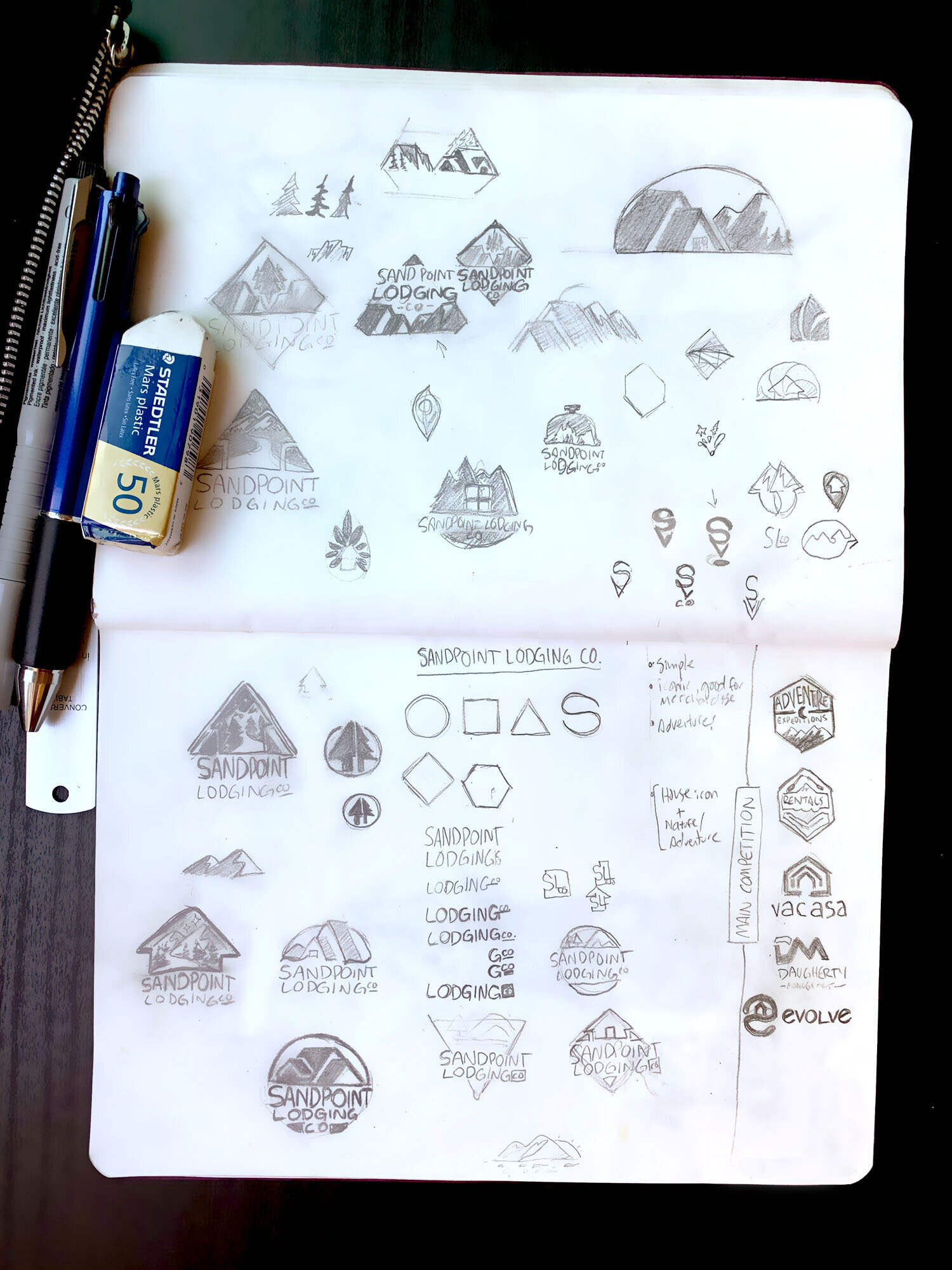
As displayed in the sketches below, I worked the silhouettes of mountains, trees, awnings, and eaves to within an inch of their lives to get an image that blends hilltops into a home, and paid particular care to the angles and perspective to make sure everything was legible from a distance.. I exhaustively researched logos in similar market cross sections to ensure I wouldn’t be overlapping anything existing, cultivating a fresh, energizing look using elements that are common in the region.
City of Sandpoint
I was thrilled to work with the City of Sandpoint — voted Most Beautiful Small Town in America by Rand McNally — to develop their very first comprehensive brand!
In a region where logos are dominated by mountains and lakes, it was a unique challenge to develop a visual brand that espoused the wonderful selling points of the area (namely the stunning lake and mountains, and the marvelous Long Bridge that takes you into the city) in a fresh way that stood apart. The logo I created now adorns the city on signage, art installations, vehicles, government documents, and more.
Project Background
I explore every nook and cranny of a concept before settling on the perfect solution. Below, you can see some of my initial sketchbook thinking to work out the shapes and angles I would end up using, and what elements were most important for the project. I went on several photography expeditions to get source material to get everything looking as faithful as possible, and find angles and vistas that inspired me.
Further down is a sample of the dozens of iterations I created when I took my work into Illustrator, playing with color, form, and typography to nail down a look-and-feel. I selected two to polish up and present to the clients. The final logo ended up, as it usually does, a blending of several ideas; though many sketches are eventually left on the cutting room floor, there are often pieces of them I particularly like, and the final logo typically features an amalgam of initial ideas.
My Role
• Pitch for client RFP, presentation design & delivery
• Client focus grouping & audience research
• Initial logo ideation, sketches, and concepts
• Work presentation to clients, feedback collection
• Revision rounds, logo polishing & final presentation
• Design of additional materials, lockups, implementations, and branding style guide
Early sketches and concepts in progress
Iterative Process
In my journey as a designer, I've found the iterative process to be an invaluable companion. It's like setting out on an exploration, where each iteration is a step deeper into the realm of possibilities. By continuously refining and evolving these ideas, I can sift through the multitude to uncover the gems—the strongest solutions that resonate most profoundly with the challenge at hand.
It's a dialogue with creativity, where feedback and adaptation guide us towards a design that not only meets but often surpasses expectations. This approach ensures that no stone is left unturned in our quest for the perfect design solution, embodying the essence of collaboration, innovation, and excellence.
Stylebar Beauty Bar
Stylebar was the first blow dry bar in Idaho, and continues to be one of the most sought-after and highly booked in the Pacific Northwest. I worked with them to create the logo, brand, website, and marketing for this blooming chain of high-end salons.
The brief specified that the look and feel should call to mind haute couture and high fashion magazines. They also wanted something that could be used as a full logo or a standalone icon, while still communicating what the business did with just one glance.
My Role
• Client pitch, meetings, and presentations
• Initial logo research, sketches, and concepts
• Work presentation to clients, feedback collection
• Revision rounds, logo polishing & final presentation
• Design of additional materials, lockups, implementations, and branding style guide
• Website design & development
• In-store signage, menu, rack card design
• Ongoing client relationship including ad campaigns, photo retouching, and creative direction
Excerpts from Stylebar’s first menu brochure, showcasing my photo retouching, art direction, typographic treatment, and layout.
Iterative Process
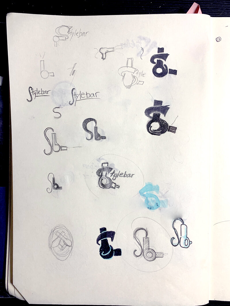
Presented here are pages of sketches from initial ideation. I was particularly interested in getting the “S” just right, as it would be used as the basis for the icon version of the logo. Also a priority for me was incorporating the blow dryer, as at the time, Stylebar was strictly a blowdry bar (but has since pivoted to a full service salon).
This allowed me to create a stylish logo that instantly tells the viewer what the business does. It can’t always be the case, but I feel it’s important for a logo to communicate as much to the viewer as possible in the least amount of information; for me, creating a logo is the act of distillation, blending information with emotion to create a connection with the audience and build rapport from the very first moments.
Timberline Helicopters
Timberline Helicopters, an international industry-leading aerospace company, asked me to develop a suite of logos for their corporation and subsidiaries.
Now emblazoned upon a fleet of top-of-the-line aircraft and a plethora of apparel, merchandise, and consumer goods, the Timberline Helicopters brand has become one of the most celebrated in its industry.
My Role
• Initial logo research, sketches, and concepts
• Work presentation to clients, feedback collection
• Revision rounds, logo polishing & final presentation
• Design of additional materials, lockups, implementations, and branding style guide
• Website design & development
• Brochure design
Expanding the Brand
Timberline loved the identity I produced for them so much that I was called on to expand the brand family to include Timberline Holdings, Aerospace, and Logging subsidiaries. The client wanted a look-and-feel similar to the original, so I kept the typography and color scheme similar as I worked the initials into a bold icon that created a cohesive family, seen below.
